Fountain Pen Ink Swatches
Detailed swatching videos of Ferris Wheel Press fountain pen inks. Calm musically escapes comparing ink swatches and writing samples.
Detailed swatching videos of Ferris Wheel Press fountain pen inks. Calm musically escapes comparing ink swatches and writing samples.
Mixing and Swatching Light Ferris Wheel Press Fountain Pen Inks with Darker ones to make them more readable.
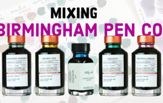
Birmingham Pen Co. Mixing and Swatching 5 different inks - Magnolia mirage, Ceramic Kiln, Pennsylvania Slate, Aqueduct, Abandoned Shipyard
Birmingham Pen Co. Mixing and Swatching 5 different inks - Magnolia mirage, Ceramic Kiln, Pennsylvania Slate, Aqueduct, Abandoned Shipyard
Birmingham Pen Co. Mixing and Swatching 5 different inks - Magnolia mirage, Ceramic Kiln, Pennsylvania Slate, Aqueduct, Abandoned Shipyard
SF Pen Show 2023
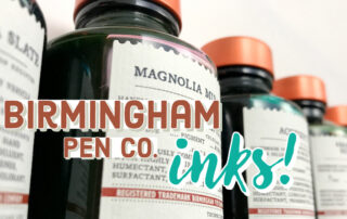
I got these Birmingham Pen Co. inks a couple of months ago but ended up getting COVID so I was out sick for a while. Sorry for my voice, I am better now but some of this footage is from early August :)
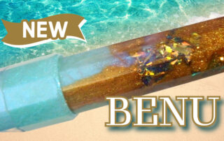
BENU x Atlas Stationers Exclusive - BENU Euphoria Gold Coast Fountain Pen Review
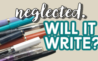
Testing my fountain pens after not using them for over a month. Will they write?
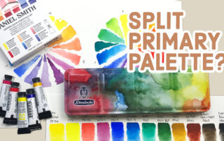
Red, Yellow, and Blue (warm colors) are chosen for their versatility in creating a wide range of hues, but cool colors such as Cyan, Yellow, and Magenta, can also be utilized. A split primary palette expands the range by including both warm and cool variations of each primary color. Warm colors are closer to red-orange while cool colors are closer to green-blue or yellow-violet. The concept of warm and cool colors can be applied to analogous colors of similar hue.