September 17, 2021
Kuretake Gansai Tambi Watercolor Swatches
Traditional Japanese Gansai Watercolors
A relaxing swatching session of the Kuretake Gansai Tambi 48 Color Watercolor Pan Set. This is just a short stroll through the vivid and delicious Traditional Japanese pan watercolors from Kuretaki, they are perfect for professional artists and crafters.
They are highly saturated and perform similarly to Western watercolors, but do have some subtle differences that you may not be aware of, like a slightly glossy finish and easy reactivation and liftability (is that word?) once laid down. Some people think they are more like gouache than watercolor, but I don’t think they are as opaque a gouache (which is why I would use gouache) so they definitely fall in the watercolor space for me.
❊ You can get the 48 set on Amazon here*
➤ See me trying them out in a painting here
From the Kuretaki site:
“A wide range of vivid colors can be used without mixing colors. Bold colors that are lightfast, so your drawing will remain vivid. It can be used for a variety of purposes such as sketching, illustration, sumi-e, and more! Water-based pigment paint can be highly opaque when used solely as a gouache but can also become more transparent depending on the amount of water added for dilution. The large 48mm x 28mm pan makes it easy to use larger, thick brushes and color large surface areas in artwork.”
I really enjoyed swatching this beautifully presented set and I hope to post some work soon using them.
Affiliate Discount Links
- Jackson’s Art Supplies 10% OFF first purchase*
- Skillshare 30 days FREE Trial*
- FREE Royalty-Free Music from Thematic*
- FREE Royalty-Free Music from Uppbeat*
- 50% OFF Amazon Prime Membership for Students*
♥ Links marked with ‘*’ are affiliate links – If you end up purchasing something using these links I may earn a commission that will help to support this channel at no additional cost to you! Thank you so much for your support.
As an Amazon Associate, I earn from qualifying purchases.
Swatching Photos


Video Transcript
Hi guys. So today we’re going to look at the 48 color Japanese Gansai Tambi watercolor palette by Kuretake. I actually got this as a gift from my parents. It was my son’s birthday and they sent this along to me too, because, you know, I guess I made him, so that was very sweet. So they live in Australia and I live in the US (America) and when they send a gift to the family, sometimes they’ll just throw in a little care gift for me, which is really nice. So thanks guys. I really love it. And I’ll think of you guys when I’m using it.
Okay. So let’s take a look at these paints. I think the most common misconception going into using these paints is that they’re going to act the same way as a traditional Western watercolor pate. When in fact, these are sort of a different thing. The main difference that I’ve found when doing research about [00:01:00] this is that these traditional Japanese Gansai paints are made up with using a binder that is glue based. So like an animal hide glue base, or a combination of glue and sugar and glycerin instead of the traditional gum Arabic that’s used in Western waters. The main thing that I noticed straight after opening them was that the paints sitting in the pan are super shiny and glossy.
And that does transfer a little bit into the end product once you’ve painted them. When I did these swatches, at the end, you can see that they are a little glossier, and they do take quite a long time to dry. And I think that’s because of that glue base and I definitely did notice this when I went back into label, all these swatches when I had finished, my hand was sort of resting on top of some of the swatches and it was sort of sticking so there was a little bit of tackiness still after, probably about five or 10 minutes or so. So, the ones where I had put the mass [00:02:00] tone color that they were still, some of the colors was still a little tacky, but the washed back ones were totally fine totally dry, just like Western watercolors. So I think that that binder does play a little bit of a part in the texture of the paint at the end, the shininess and the drying time.
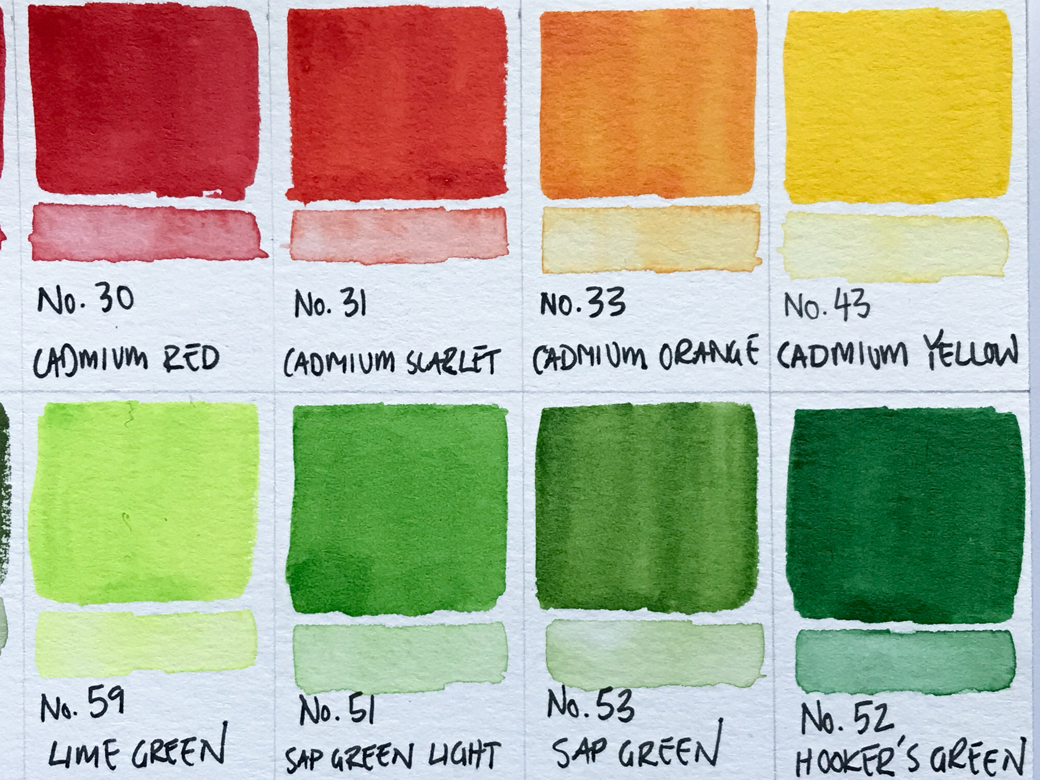
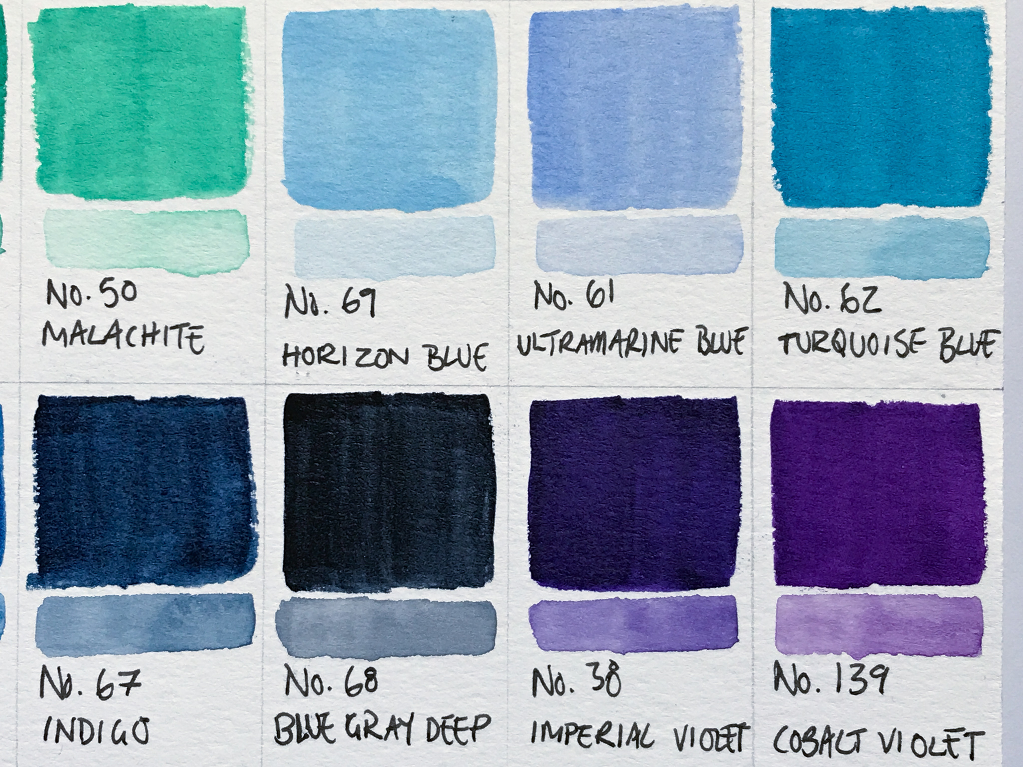
So, as you might’ve noticed through swatching this selection of greens, there’s quite a few of them in this collection. In total there’s 48 colors and 11 of them are in the green area. So from lime green to sort of the Aqua seafoam green. So just to keep that in mind, if you’re thinking about purchasing this, this palette, there’s quite a lot of greens in there which may work out great if you’re sort of a landscape or botanical artist. I think this set would be really great, the range is really dynamic from nice pinks and reds through the blues and purples and [00:03:00] that those couple of metallics, it’s a really good, mix of colors. It’s just kind of heavy on the greens.
In this swatching what I’m doing is just sort of trying to get the most dense, mass tone than I can. And I tend to do that with all my swatching, if you’ve seen any of my other videos, I like to get like the full strength of the color and then kind of do like a little wash underneath it, doing it this way really allows me to see the full potential of the paint, to see how much pigment is in there and how far I can stretch it and how dense I could get a color. And then having the even the brightest colors can have a real subtlety to them that you wouldn’t have guessed when you just look at the mass tone.
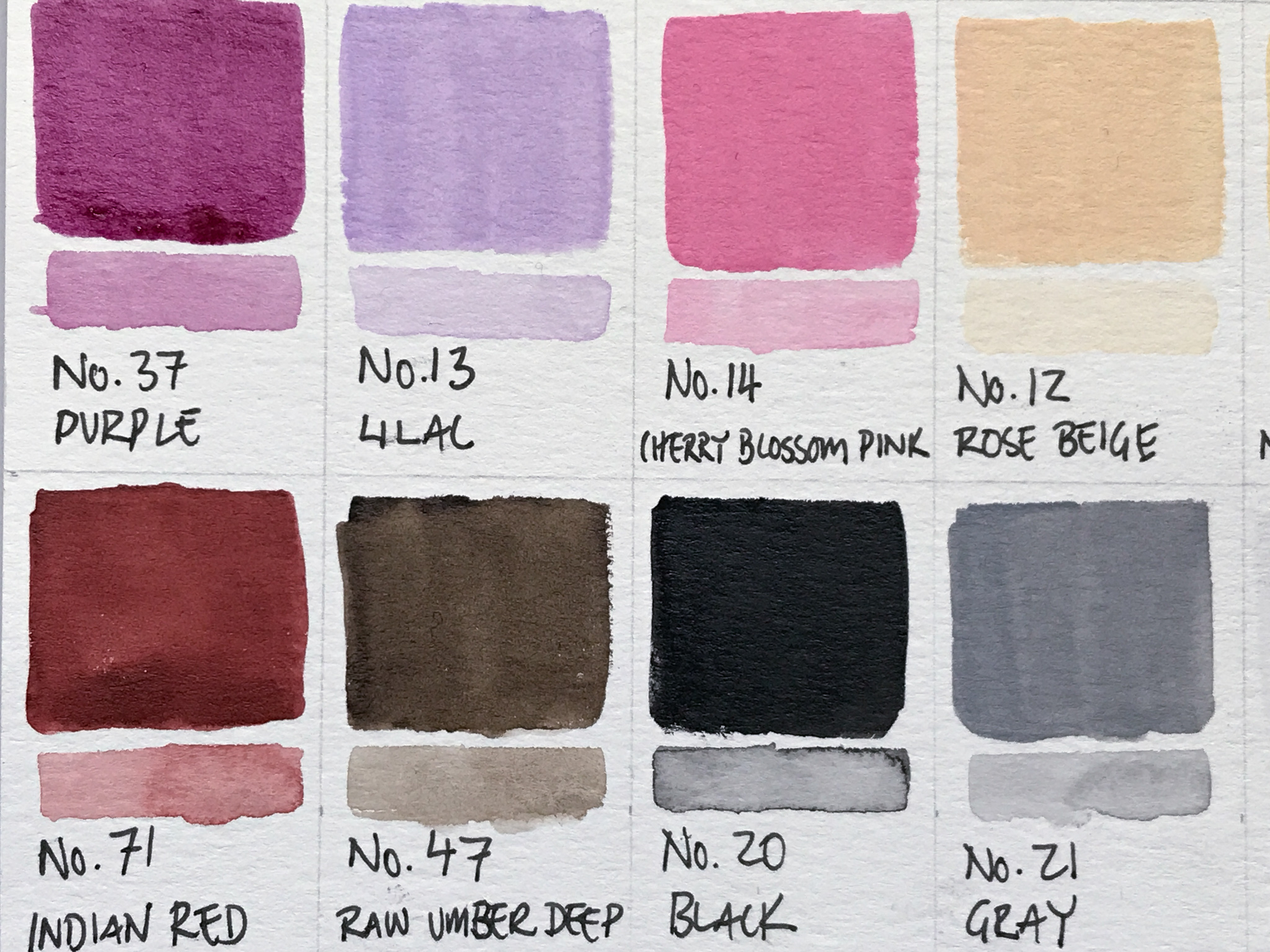
So now we’re kind of heading into the creamy pastel set of colors. I think there are maybe four of these. There’s a lilac, a cherry blossom pink, a rose beige, and a natural beige. And they’re just the purple, pink, and sort of an apricot and the yellow color. So these are really nice. They definitely have the addition of white in there so they are a bit heavier, a bit thicker, more opaque than the other colors in here. But they’re super pretty, really nice for botanical sort of floral designs. So really, again, a nice sort of blend of colors in this collection.
So, unfortunately, I think there was some oil on the paper here probably from a fingerprint or something. I tried to sort of work the paint into the paper there, but you can see it’s kind of resisting. It has nothing to do with the performance of the paint. Unfortunately, it was just something that was on the paper.
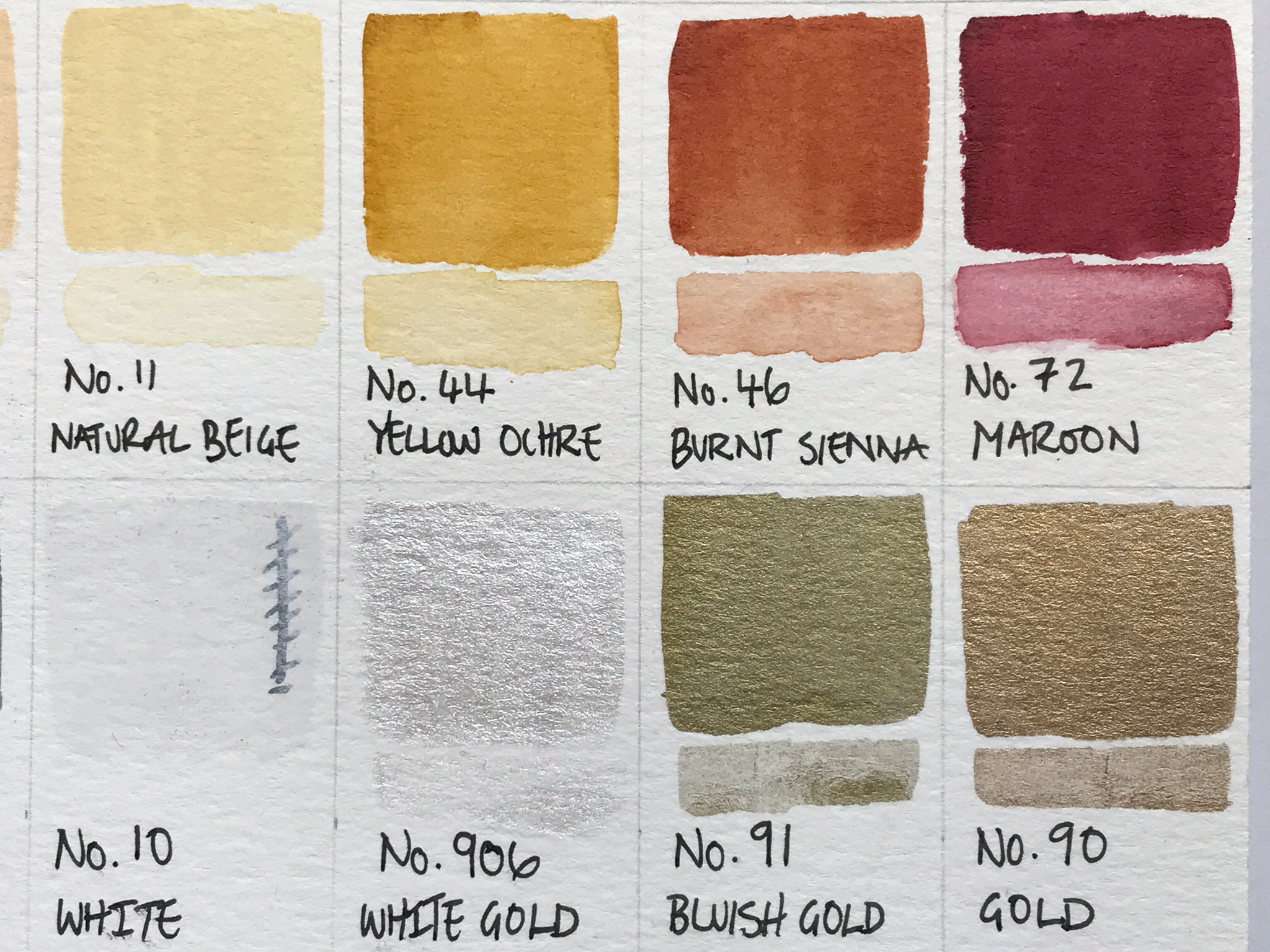
And I think the next couple of swatches have that issue too, but overall the paint performed really, really well. Laid down super smooth. Once you sort of worked the water into the little pan. And, it actually lifts really easily too. On some of the washback stripes underneath the mass tone color I laid down a little bit too much paint so I went back in with a slightly wet brush and just lifted a little bit off and it does lift super easy. So I think other people that have switched this pallet out to have mentioned that the Gansai paints are really quite easy to lift. So if that’s the way you like to work, this may be a really good set for you.
So here are the three metallics that come in this set, there’s this white gold, which has sort of a silvery pearlescent, transparent kind of color. And there’s a bluish gold, which is sort of like an antique, sort of greenish gold. I don’t know why it’s called bluish it’s [00:06:00] more towards the green and then there’s the one that’s just called gold, which I think leans more towards rose gold than the traditional yellow type of tone gold is a really, really pretty color.
Uh, So here is just some close up of the swatches once they’re completed with their names. I know when I’m looking at, swatching online, I like to see the exact color with the name and the number and everything. So I thought I’d just put these up so that you can take a good look at them and if you’re looking for a particular color, you can see them in detail here.
I also have them on my website. I’ll put a link below if you wanted to look at them in more detail. But other than that, I think we’re done with this watching and thanks for sticking around hope it was nice and relaxing. And I’ll try and post some work using this, palette soon. Thanks guys. Bye.


Leave A Comment